Response Builder
The Response Builder is a powerful tool for creating rich, multi-part responses within your workflows. It allows you to combine various elements like summaries, data tables, pipeline overviews, and top deals into a single, comprehensive output. This capability ensures your automated responses are not only informative but also visually engaging and easy to understand.
Response Builder Demo Overview
This demonstration will guide you through the Response Builder, highlighting its core functionalities. We'll explore how to define the output destination, add various components, and utilize the eleven different component types available. This will enable you to construct dynamic and detailed responses for any workflow scenario.
Response Builder on the Canvas
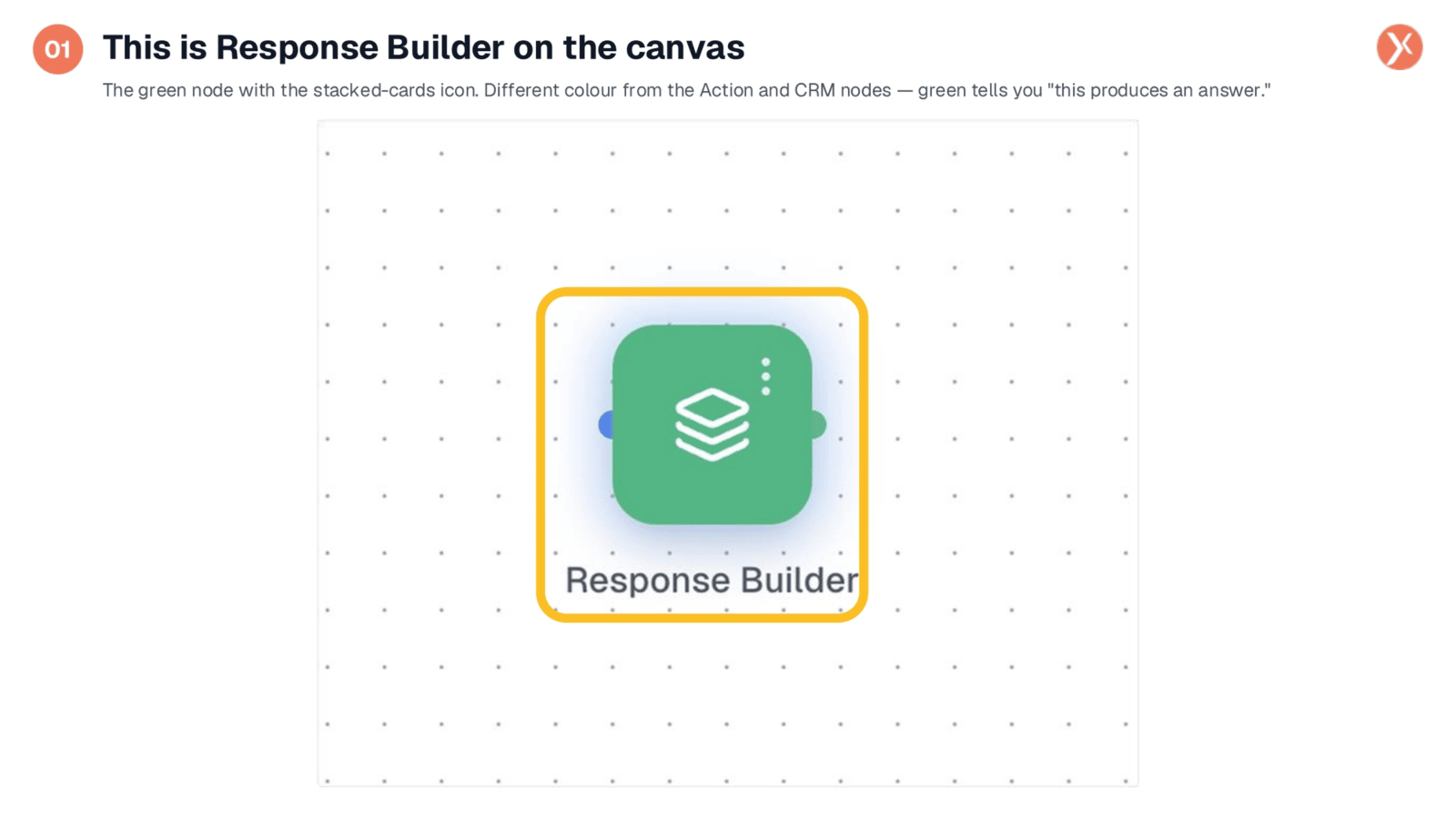
On the canvas, the Response Builder appears as a green node with a stacked-cards icon. This green color signifies that it's a node designed to produce a response back to the workflow's caller, whether that's a user in chat, an agent, or an API consumer. Simply drag it into your workflow, connect it after the nodes that generate your data, and then double-click to begin configuration.
Opening Response Builder Configuration
To configure the Response Builder, simply double-click the node on the canvas.
Two Top-Level Decisions for Response Configuration
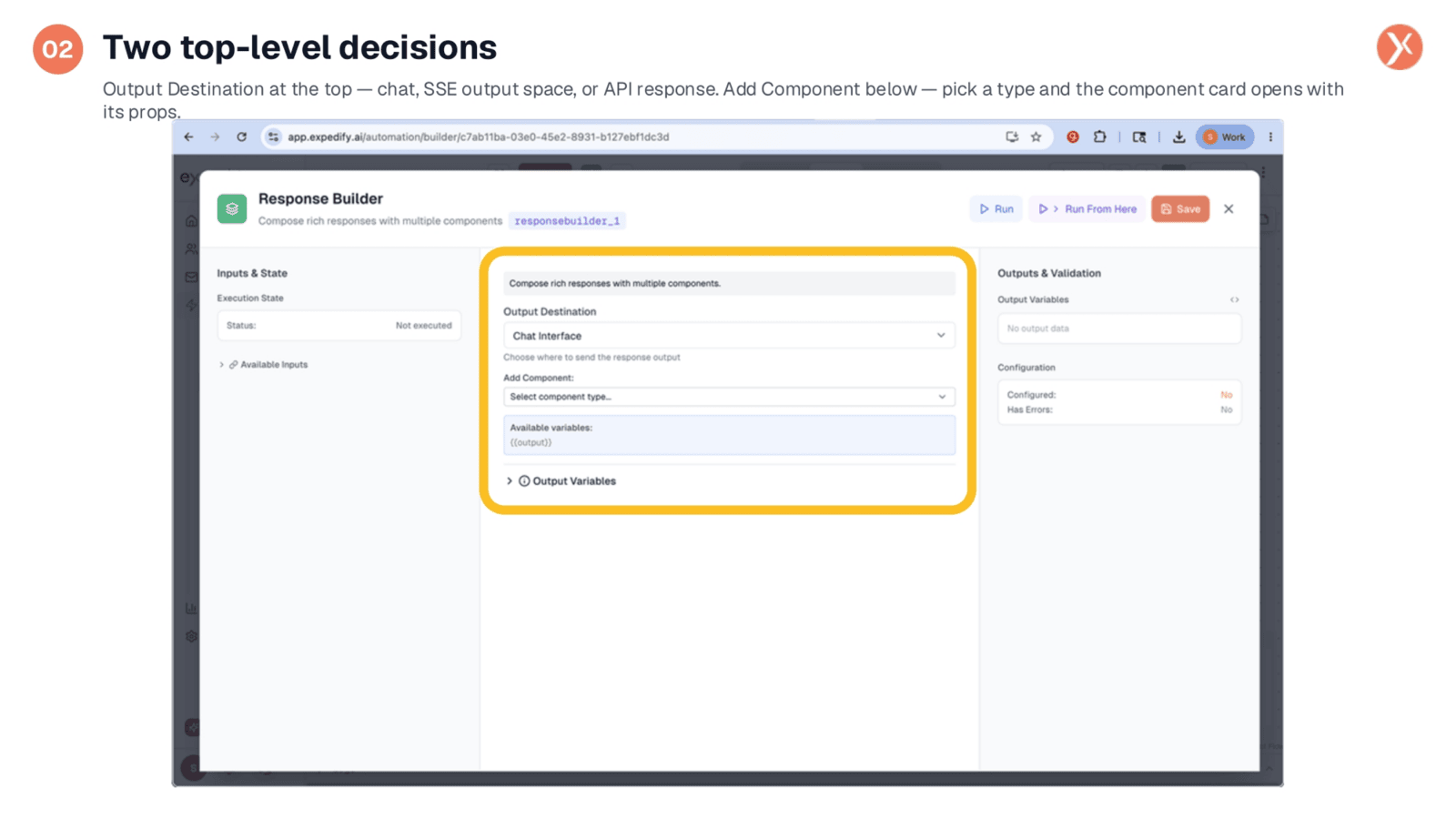
Upon opening the Response Builder panel, you're presented with two key decisions. First, select the Output Destination, which dictates where the rendered response will be sent. Options include the Chat Interface, SSE Output Space for agent UIs, or an API Response. Second, use the 'Add Component' section to stack the individual pieces of your response, building it one component at a time.
Adding Components: Selecting a Piece
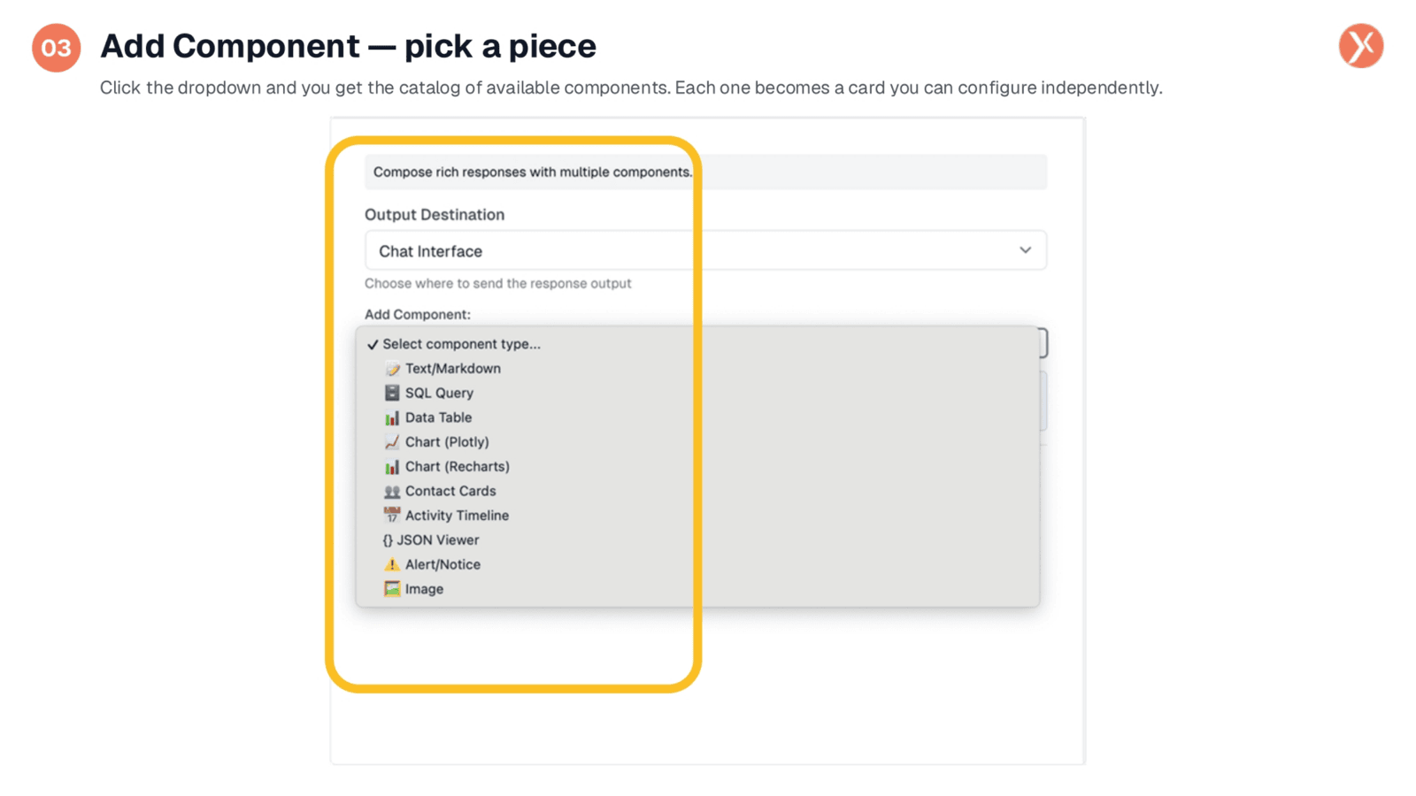
Clicking 'Add Component' reveals a dropdown menu with a comprehensive catalog of available components. There are eleven distinct types, each represented by an icon and label, corresponding to a different UI element. Once you select a component, a dedicated card appears in the panel below, allowing you to configure its specific properties independently. The order of these cards directly determines the order of the rendered response.
Eleven Component Types for Diverse Answers
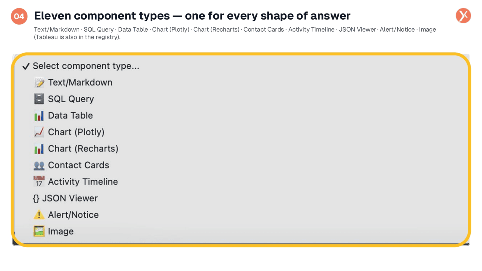
The Response Builder offers eleven versatile component types to shape your answers. These include Text/Markdown for rich text, SQL Query for displaying highlighted queries, and Data Table for interactive tabular results. You can also choose between Chart Plotly and Chart Recharts for various visualizations, Contact Cards for visual contact lists, and Activity Timeline for chronological events. Additionally, there's JSON Viewer for structured data, Alert/Notice for banners, and Image for displaying generated or uploaded visuals.
Every Component as a Configurable Card
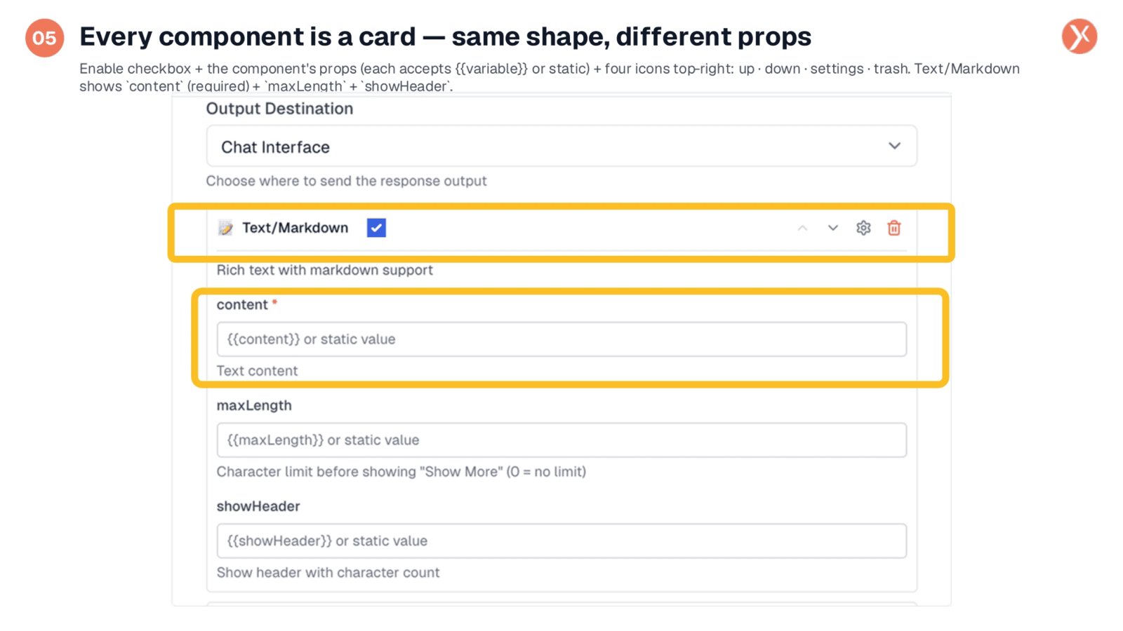
Each component you add functions as a configurable card, maintaining a consistent shape across types. The top row features the component's icon, label, an enable checkbox, and four control icons for reordering, advanced settings, and deletion. Below the header, you'll find property fields, such as 'content' for Text/Markdown, which accepts either a template variable or a static value. This pattern of variable or static input applies to every property field across all component types.
Data Table: Rendering Arrays as Rows and Columns
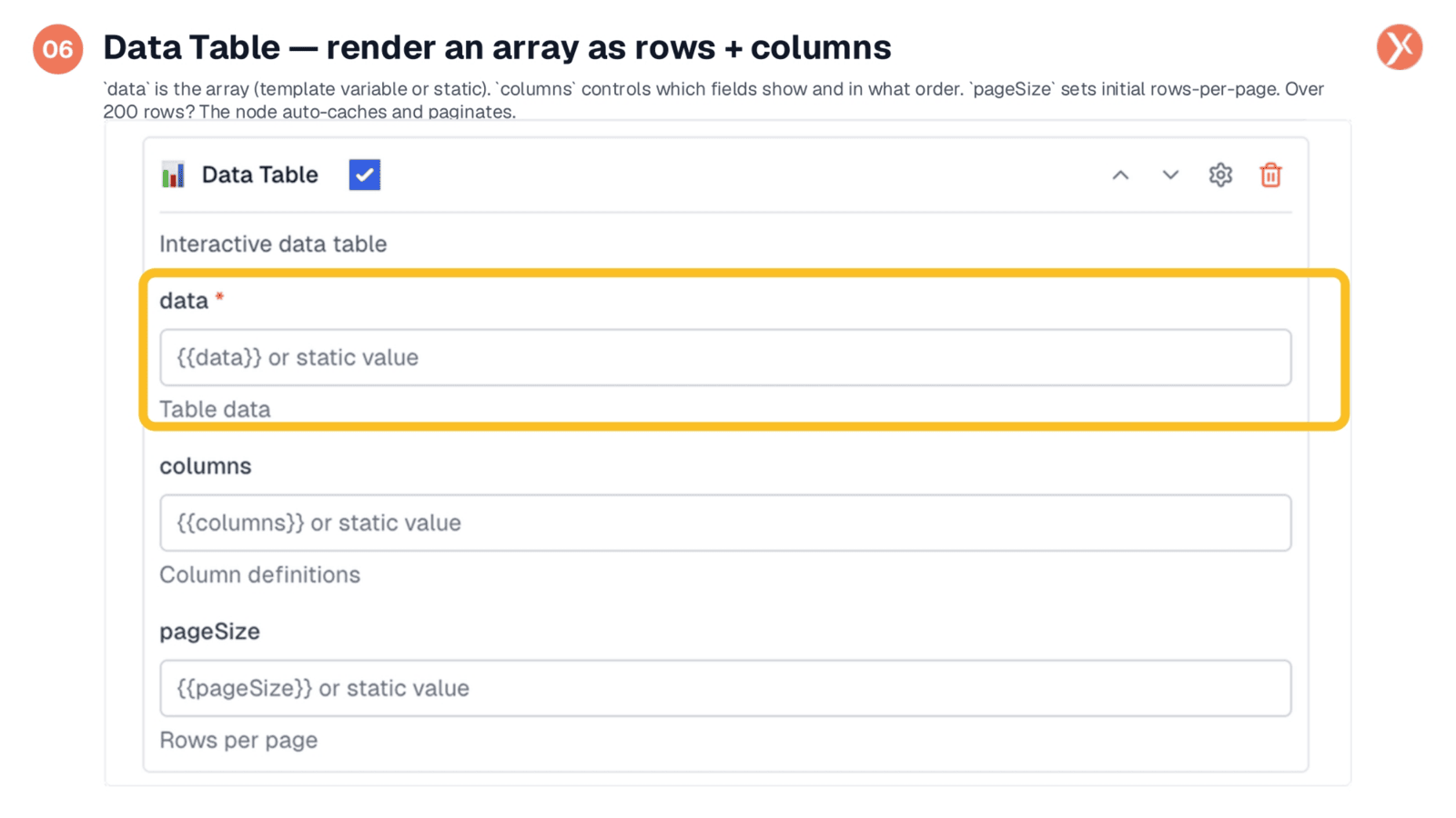
The Data Table is a frequently used component, ideal for presenting tabular data. You simply point the 'data' field to an upstream array, typically from a CRM Manager Search or Custom Analytics Query. The table automatically renders with sortable headers and pagination. The 'columns' field is optional; leaving it blank displays all fields, while defining it controls order and labels. 'pageSize' sets the initial rows per page. For large datasets, the node intelligently caches over 200 rows, lazy-loading them as the user navigates, ensuring smooth performance.
Chart (Recharts): Bar, Line, Pie, Area, Scatter
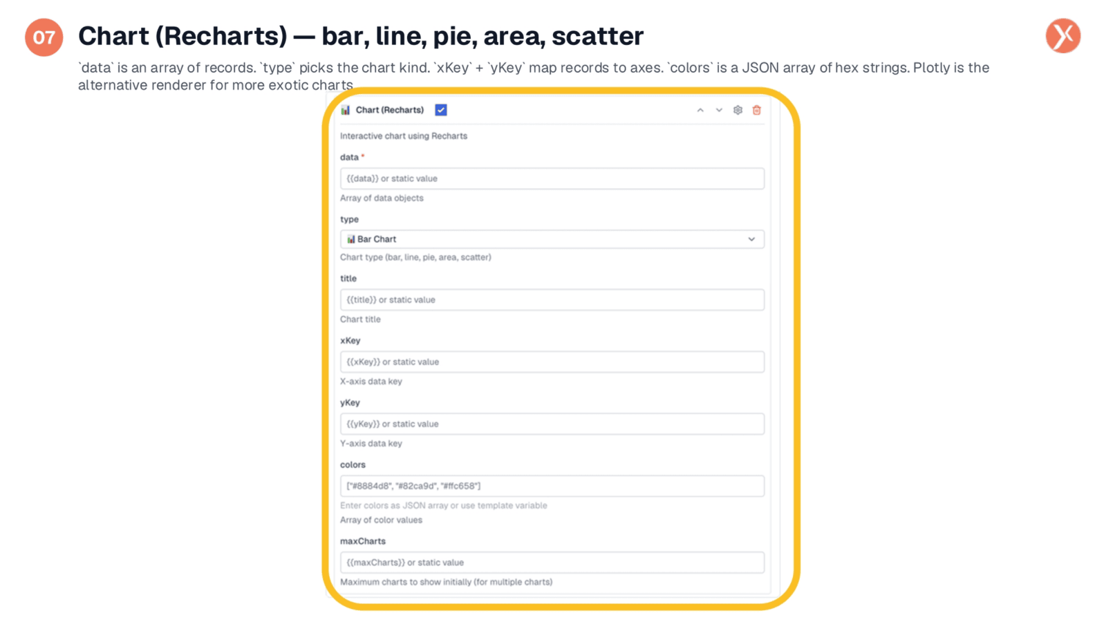
Recharts is a popular choice for charts due to its clean aesthetic and support for five common chart types: bar, line, pie, area, and scatter. To configure, select the chart type, provide an array for the 'data' field, and specify the 'xKey' and 'yKey' for your axes. You can also customize the color palette with a JSON array of hex values. Recharts, being React-native, ensures fast rendering. For more specialized visualizations like heatmaps, the Plotly component offers additional options.
Image Component: Displaying Workflow-Generated or Uploaded Visuals
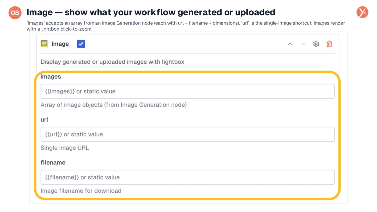
The Image component seamlessly integrates with AI media nodes, allowing you to display generated or uploaded images. The 'images' field accepts an array, typically the output from an Image Generation node, which includes URL, filename, and dimensions. These images render in the response with a lightbox for click-to-zoom functionality. If you have a single image and only its URL, you can use the 'url' field directly. This component simplifies creating visual outputs for AI workflows, eliminating the need for custom galleries.
Response Builder Outputs
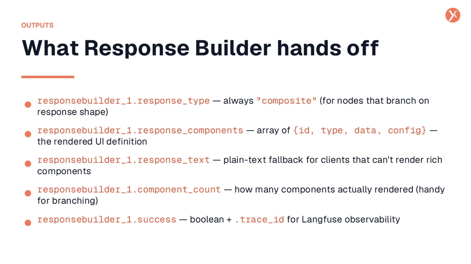
Let's explore what downstream nodes receive from the Response Builder.
Recap: That's Response Builder
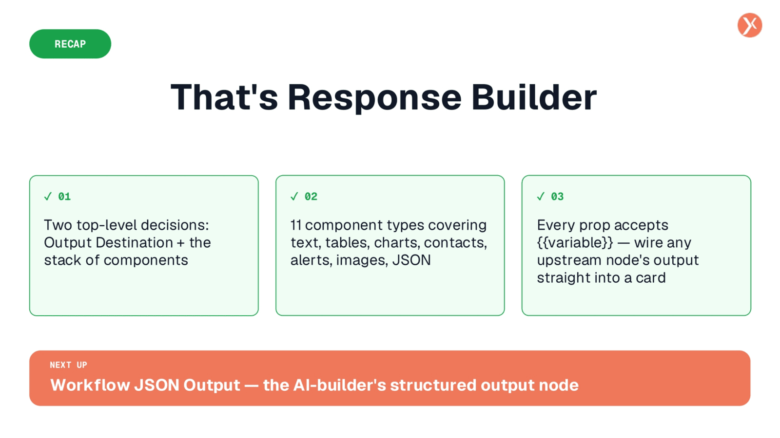
The Response Builder empowers you to create sophisticated, multi-part responses. It's driven by two top-level decisions: defining the output destination and stacking various components. With eleven distinct component types, it covers every possible shape of answer a workflow might need. Crucially, every property on each card accepts a template variable, allowing you to seamlessly integrate outputs from any upstream node without writing code.